Academic Project · January 2022
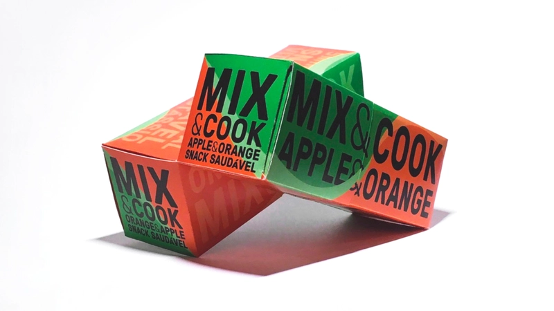
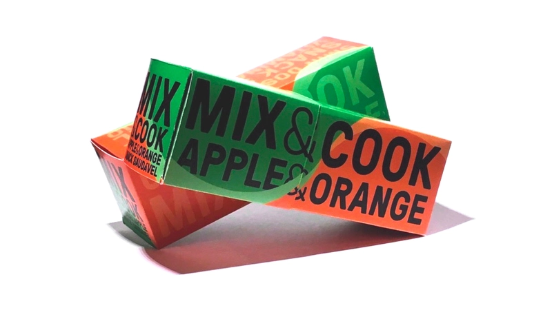
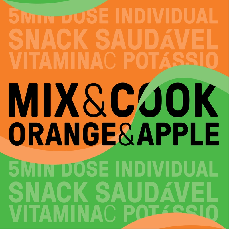
A packaging design for a healthy and multivitaminic snack with two mixable orange and
apple formulas for any time of the day - Mix&Cook - Orange & Apple.
The label and with the spatial position of the two boxes stimulates and encourages
this sense of mixture/fusion, connected with the concept behind the product.
The two formula boxes are positioned in an X shape, crossed with one another, sharing the
same diagonals.
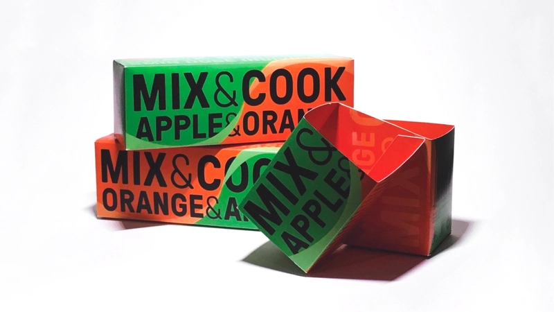
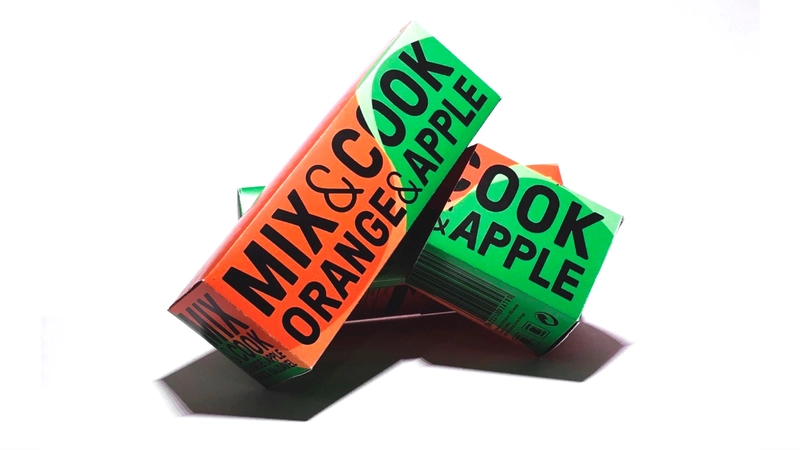
The color palette used is a reference to the primary ingredients and represents the
product's healthy value for the human body. The label is designed to be dual-sided, and when the two
formulas are separated, it still displays all the important information about the product.
The packaging also has a lid as a closing system, requiring only one sticking point.