Academic Project · February 2022
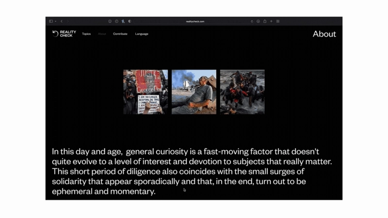
In this day and age, general curiosity is fast moving and doesn't necessarily pay the
right amount of interest and devotion to the subjects that actually matter.
This short period of diligence also coincides with the small surges of solidarity that
appear sporadically, and that end up turning out to be ephemeral and momentary. Based on the analysis of
information provided by the Google Trends platform, from the perspective of developed and developing
countries, the events (and movements that followed them) from the past 10 years were collected. These
incidents, that are still impactful and should have continued to be relevant nowadays, have gone through
peaks of interest that quickly went into decline.
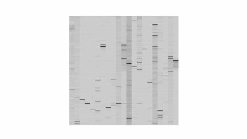
Google Trends collects data on the frequency of searches for a given topic or subject in
a particular time and place, providing a proportionate representation of how often a topic has been
searched. This tool can be used to reveal social trends in developing countries and provide insight into
the issues that matter most to people.
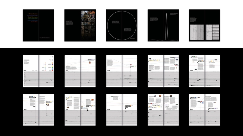
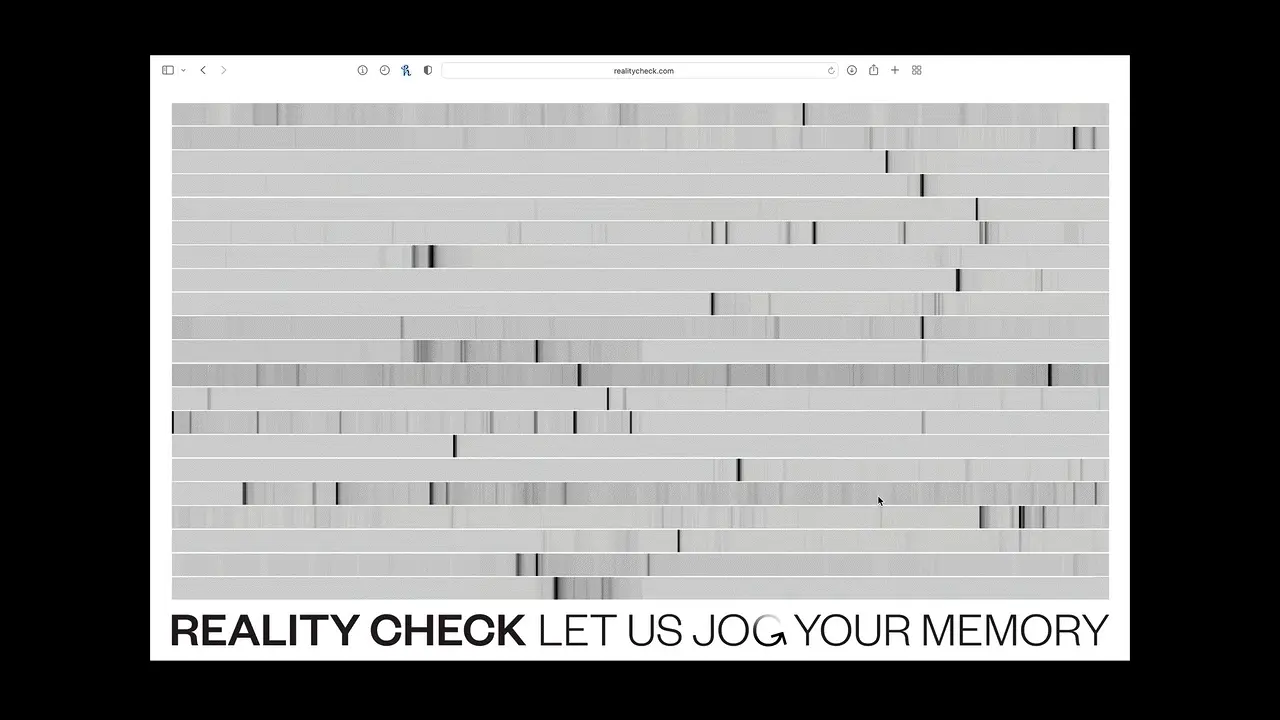
The data from Google Trends was transferred to Google Sheets and automated, so that the
values ranging from 0 to 100 were visually represented as a gradient of grays.
This way, we created an infographic that can provide additional information and be
customized with different dimensions, orientations, and orders to allow for multiple perspectives.
Editorial
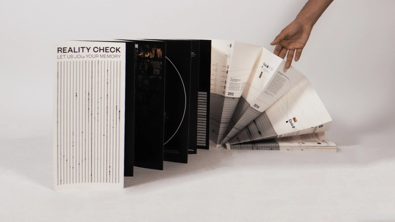
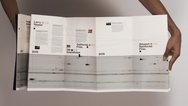
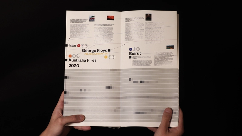
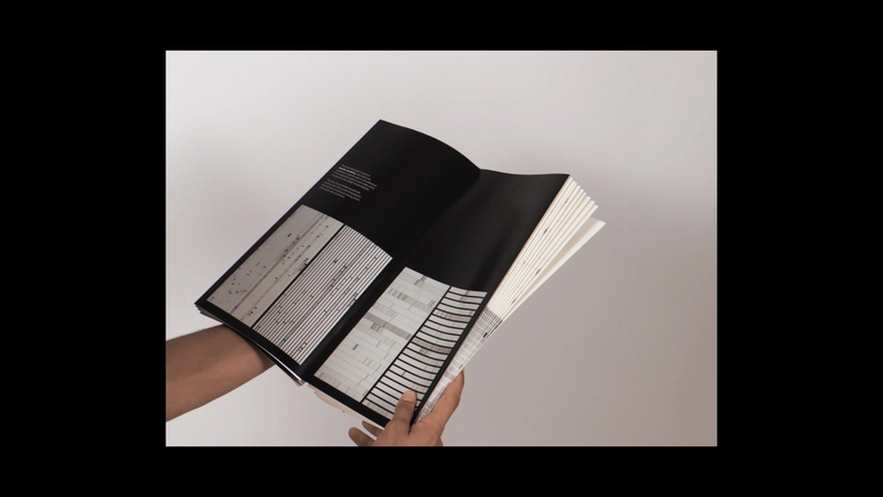
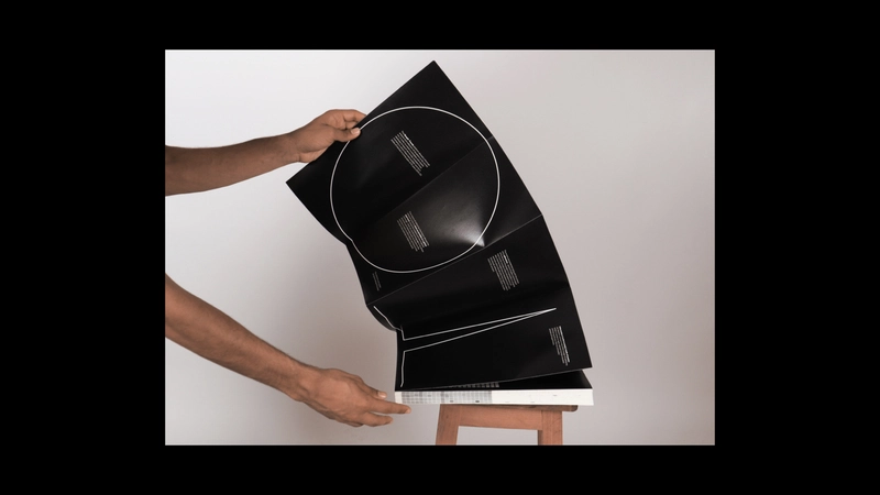
The physical result was a large flyer where the main object is the created infographic
that runs through all of it. Each spike of data was identified alongside the corresponding tragic event.
Additionally, the flyer incorporated images that were the most commonly searched related to each
specific topic/theme/subject.
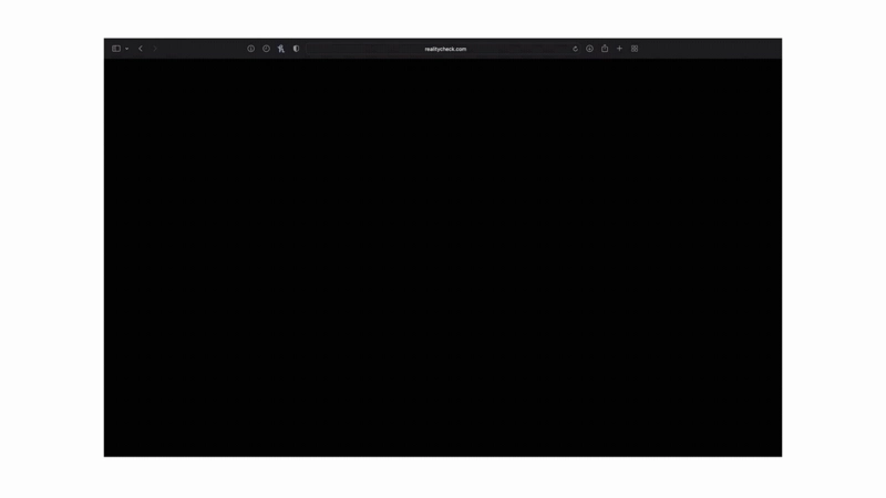
Website
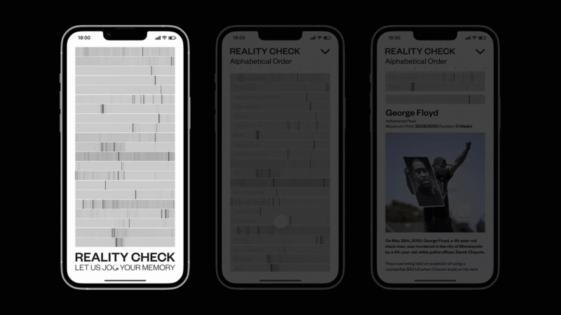
The webpage was created with the same intention as the editorial work, but with more
interactive features, which allows different ways to view the same information.
Designed with a simple box layout with buttons, the webpage allows users to customize their experience by organizing the information by time, space, popularity, general themes, and more. Users can also stack these "filters" to refine their search.
The same interface was also created for mobile platforms.