January 2024
Portuguese brand fioAgua, known for its creative, sustainable, and high-quality products,
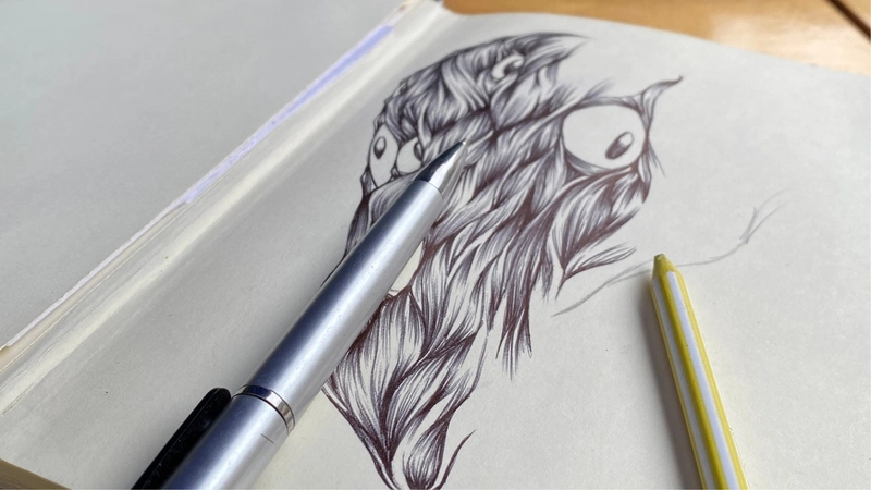
aims to develop a range of items featuring original illustrations inspired by a variety of concepts and
symbols. History, nature, and everyday life are among the themes used to produce unique illustrations
that spark the imagination of every customer.
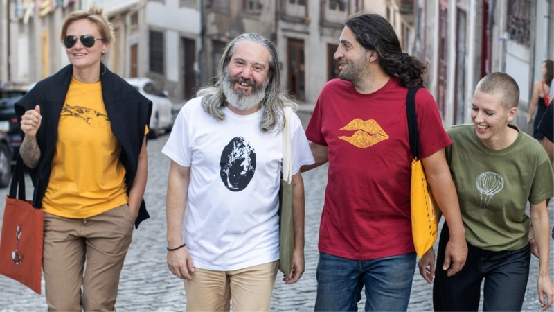
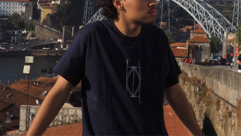
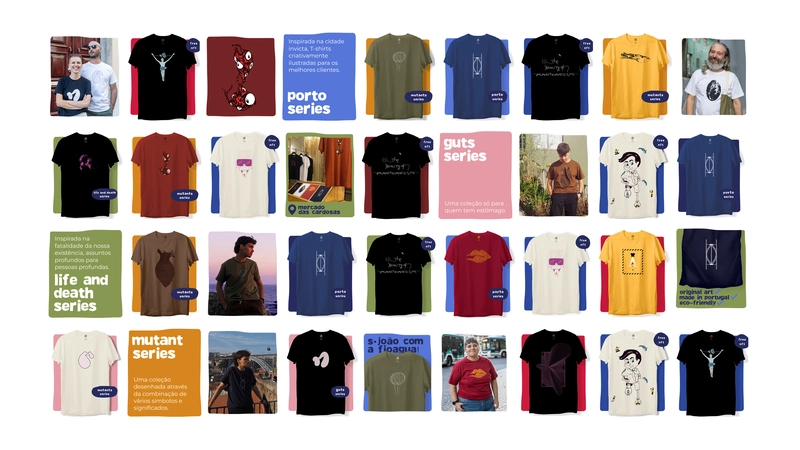
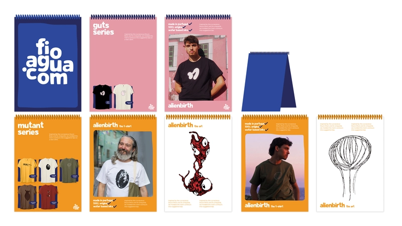
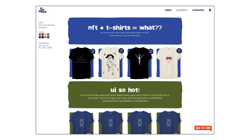
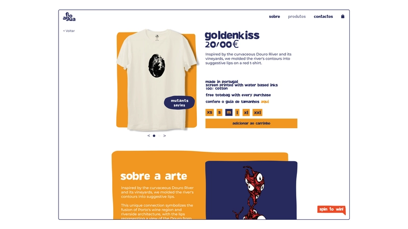
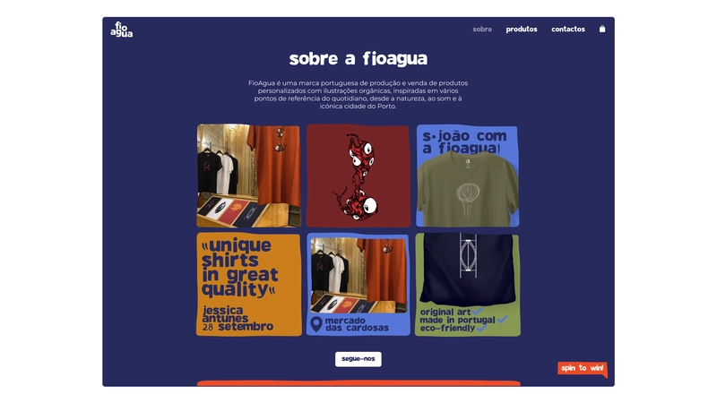
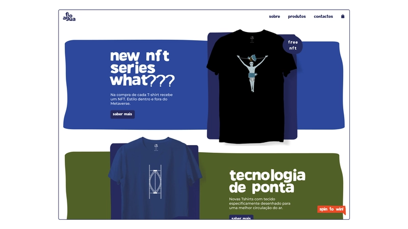
fioAgua focuses primarily on producing t-shirts, where the product becomes more than just
an aesthetic choice - it transforms into a moving piece of art, celebrating creativity and artistry.
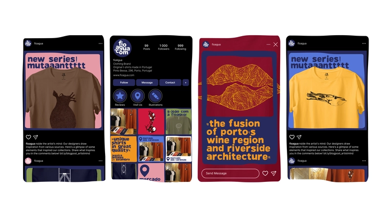
The brand's new visual identity represents a renewal and refinement of all the elements
that define it, bringing forward what makes fioAgua special: its uniqueness and originality.
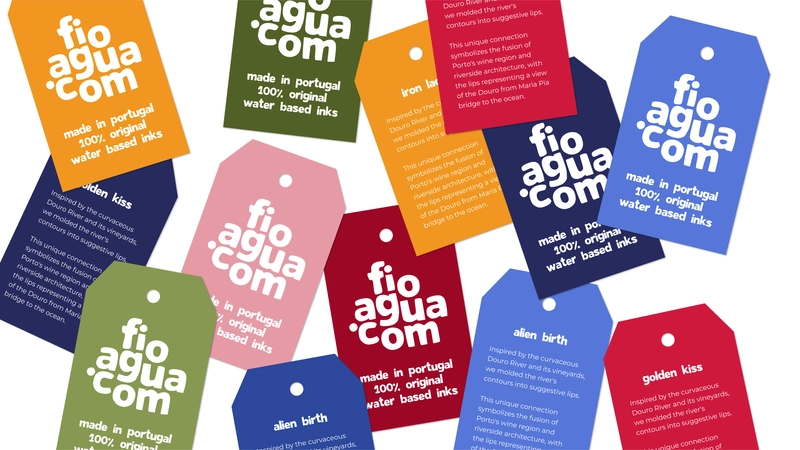
Inspired by the classic colors used in its t-shirts, the organic forms in its logo, and
the fioAgua typeface, the new branding puts greater emphasis on the products and illustrations, serving
as a platform to highlight the best the brand has to offer.
Updating the previously used typeface was essential. It underwent slight modifications,
including a refined balance between negative and positive space in all characters, the addition of new
glyphs, and improved consistency in height and spacing. This redesign was fundamental, as the new
typeface became the graphic foundation of the entire communication system, appearing across all physical
and digital media.
The new logo was based on the concepts behind the brand's refreshed identity, using the
newly updated typeface. It appears as an organic graphic stain, where the letters come together in a
seemingly disordered way, yet are guided by invisible visual cues that maintain balance between spacing
and each individual letter.
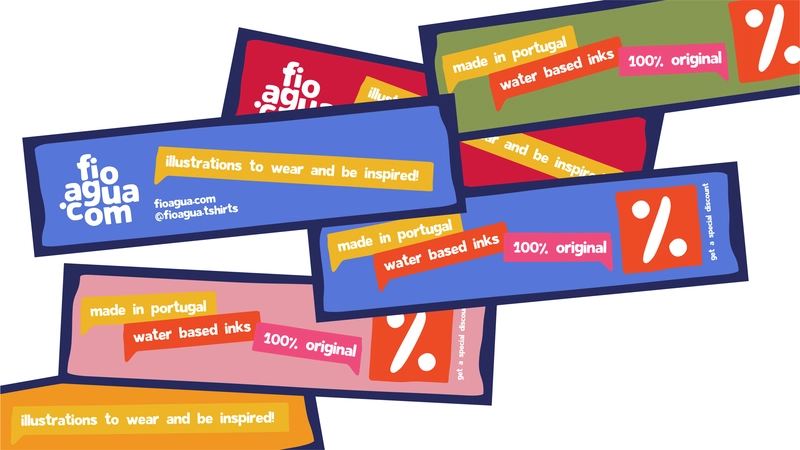
The color palette was inspired by the traditional hues found in fioAgua t-shirts.
However, it was built to organize all of the brand's products and is featured across every medium,
whether digital or physical.
The products presented here are only simulations of the final product. These digital
proposals are meant to demonstrate the potential of fioAgua's new visual identity.